
I’m going to assert that the human interface guidelines on this subject are outdated. For this, I need to go into some depth first. If you’re just interested in when to use it, I make my recommendation at the bottom.
The history
This is an ancient convention among OS HIGs regarding the use of ellipses in menu items. In essence, it works as thus:
- If you click an action in the menu, it immediately does something
- If you click an action in a menu that has a … at the end, it first asks you something (in a dialog box).
Details for different HIGs can be found on Stackoverflow, strangely enough. I find this section particularly interesting:
The visual cue offered by an ellipsis allows users to explore your software without fear.
Fear. That’s not a word I want to see anywhere near my UX evaluation form. And visual cue? It’s only slightly larger than the smallest possible symbol.
So I dug around a bit – it’s present since the very first iterations of Windows and macOS, as well as some DOS versions, during which time it actually had some affordance thanks to monospacedness:

Notably, this is a decade before “User Experience” as a term was coined. During this time, using computers indeed was scary: “one wrong keypress and everything disappears” was a thing back then.
However, ellipses didn’t actually prevent you from making a wrong keypress, but they did provide a mostly consistent way of distinguishing actions which make everything disappear immediately from actions which first show a dialog (which you can escape from) before everything disappears once you knew about this. So either you learned this pattern (which isn’t super obvious), or it does nothing for you – but gives ample opportunity for others to tell you to RTFM.
Fast forward some 40 years and computers now have variable fonts and smaller pixels (and many more of them) and ellipses have become so tiny, they’re very easy to overlook. They have been carried forward from edition to edition of the relevant HIG, but I highly doubt they’ve been reconsidered. Meanwhile, in the wild west that is the web, nobody knew about these rules, nor did anyone care, so it’s rarely seen in the web, and when website building gave way to modern webdev and mobile apps, it got completely lost here. Instead, the ellipsis has found it’s way into overflow menus everywhere, replacing the hamburger menu in some cases.
Even on Apple’s very own HIG page, this example is shown in the context of iOS:

Just like “Save as…” needs additional input so it knows where and as what to save, “Share” needs additional input before things before it can know whom to share it to. But it’s been forgotten.
Which brings us to today, where in practice this guideline is ignored when building apps.
The problems
As said earlier, the ellipses are barely visible today and don’t really offer any affordance to most people.
Additionally, the ellipses model doesn’t account for the humble Save menu option: On first use it requires you to specify where and as what to save it, on second use it is an immediate action.
There also is the question if it actually makes things easier to understand. Take one half of Audacity’s Effects menu, for example:

Outside of the absolutely overwhelming number of options (which, as an aside, I since have ordered into subcategories), you can see an overwhelming number of ellipses here, which don’t really serve anyone.
Remember, one of the stated purposes of using it is “users can explore the app without fear”. But what does a user expect when they go to this menu? Well, they want to apply an effect. Whether the effect they choose shows a bunch of sliders or not isn’t massively relevant here, it’s entirely predictable to the user what’s going to happen (an effect gets applied to the audio) and what to do if they accidentally apply an effect they don’t want (undo). There is no fear here, the ellipses are unnecessary.
Additionally, the plugin manager option used to be called “Add/Remove Plugin…”. I removed any ambiguity here on whether it’s an instant action or something that opens a dialog by renaming it to “Plugin Manager”. It’s a manager, it’s never going to be anything but some sort of dialog. Having a … here is unnecessary, because users will never be confused as to what it does.
If you still are on the fence whether ellipses actually solve a problem, consider this example:
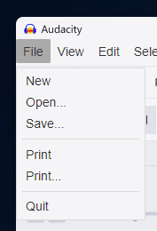
We have two print options right next to each other. Our guidelines say this is fine; the Print option is an action and works without any settings (presumably printing one page from the default printer), while the Print… option summons some sort of dialog which lets you choose printers before it does something.
Does this look any intuitive whatsoever to you? To me it doesn’t, at all. This may be fixable by making it less ambiguous (“Print now using default printer” vs “Print setup” or something), but as it stands, it’s just a duplicated option and you’ll never know which one to click.
Especially when you’re not wearing glasses.
When to use ellipses today?
With all of the above in mind, I’d say the new guidelines should be as follows:
- Use ellipses in menu items when the text itself is incomplete. So for example, “Save as…” would retain the ellipsis, while “Save Copy”, “Create Backup” or just “Save” would not have one.
- When naming menu items, name them clearly and unambiguously. For example, an option simply titled “Overwrite” on it’s own is ambiguous as to what is being overwritten. Adding this information makes it much more clear: “Overwrite my_holiday_photo.jpg”. In the example above, “Add/Remove Plugins…” is ambiguous, “Plugin Manager” is not.
- Use ellipses in cases where not doing so would confuse users. There’s no point going “but the guideline says” when your users are getting significantly confused by what you’re doing. This is universally true in design.
- Avoid using ellipses in all other cases.
 Leo Wattenberg